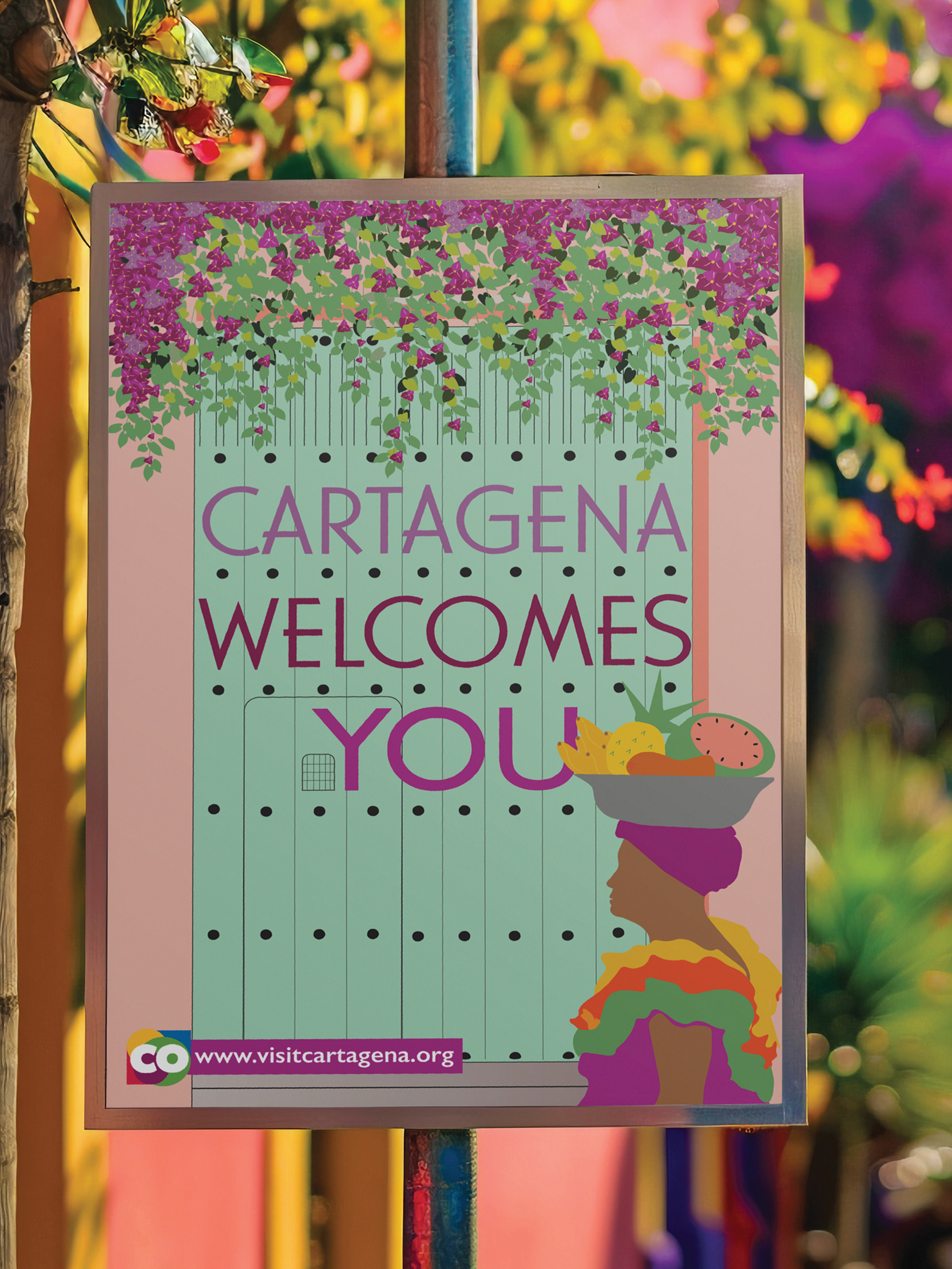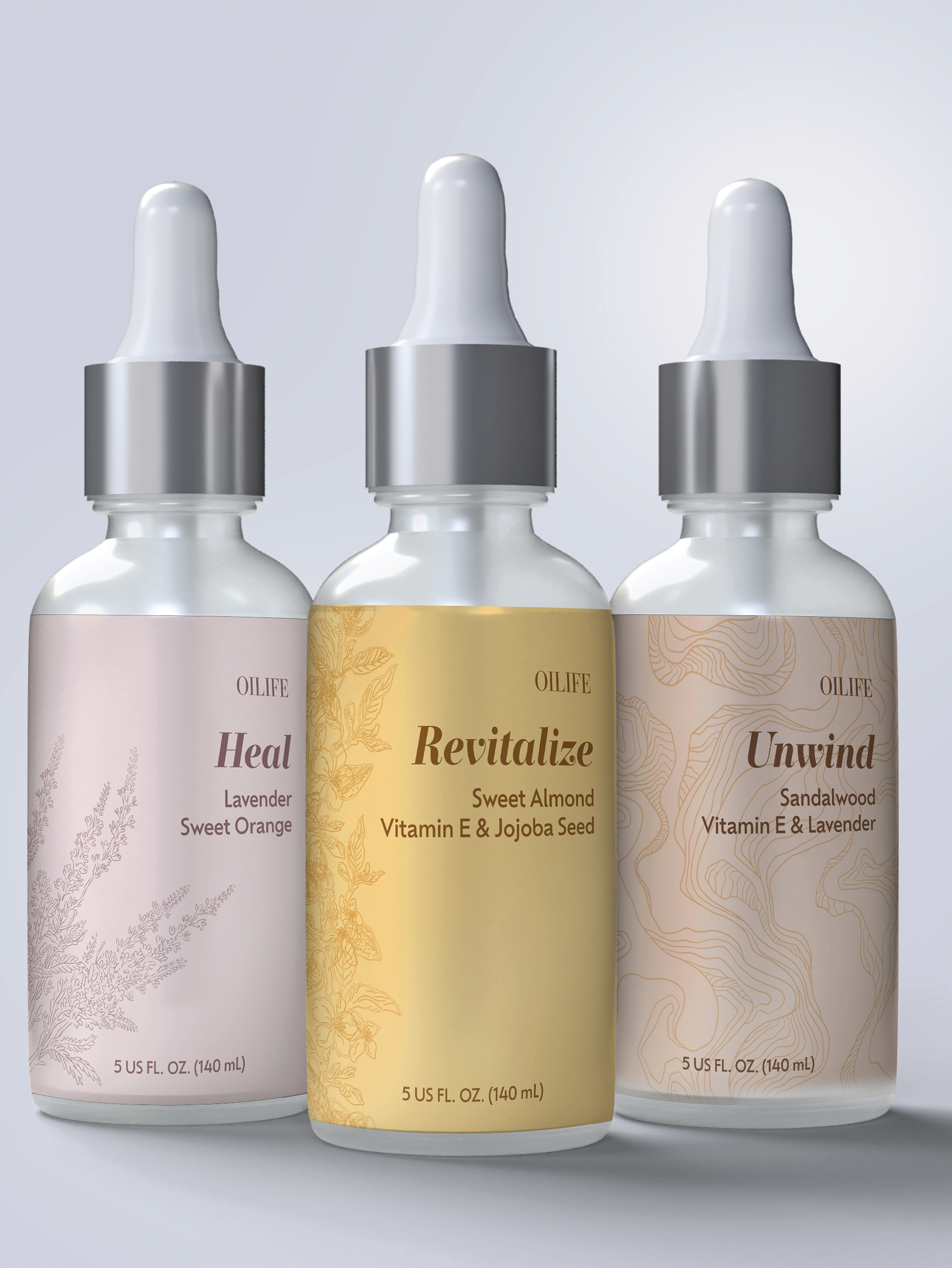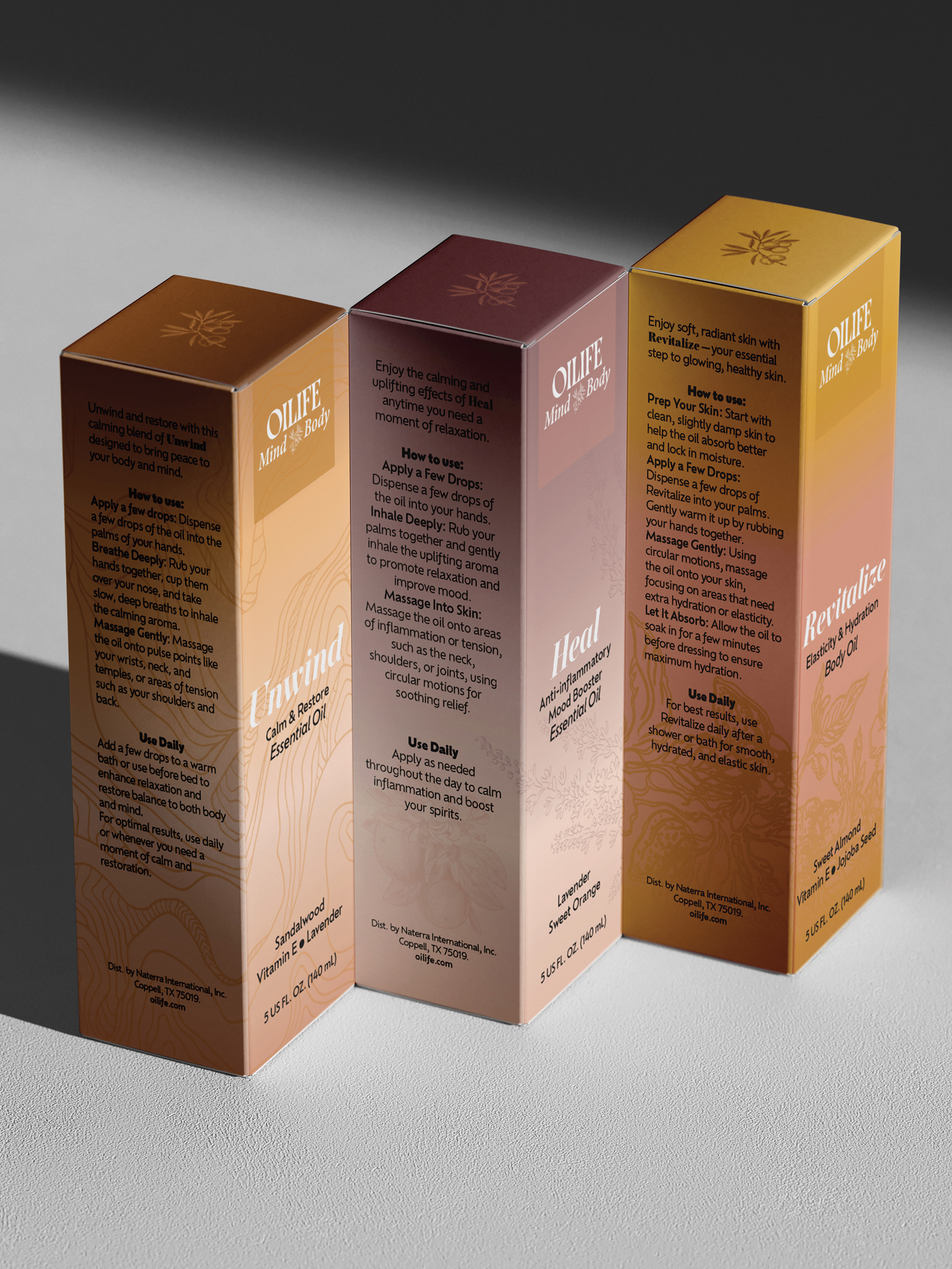
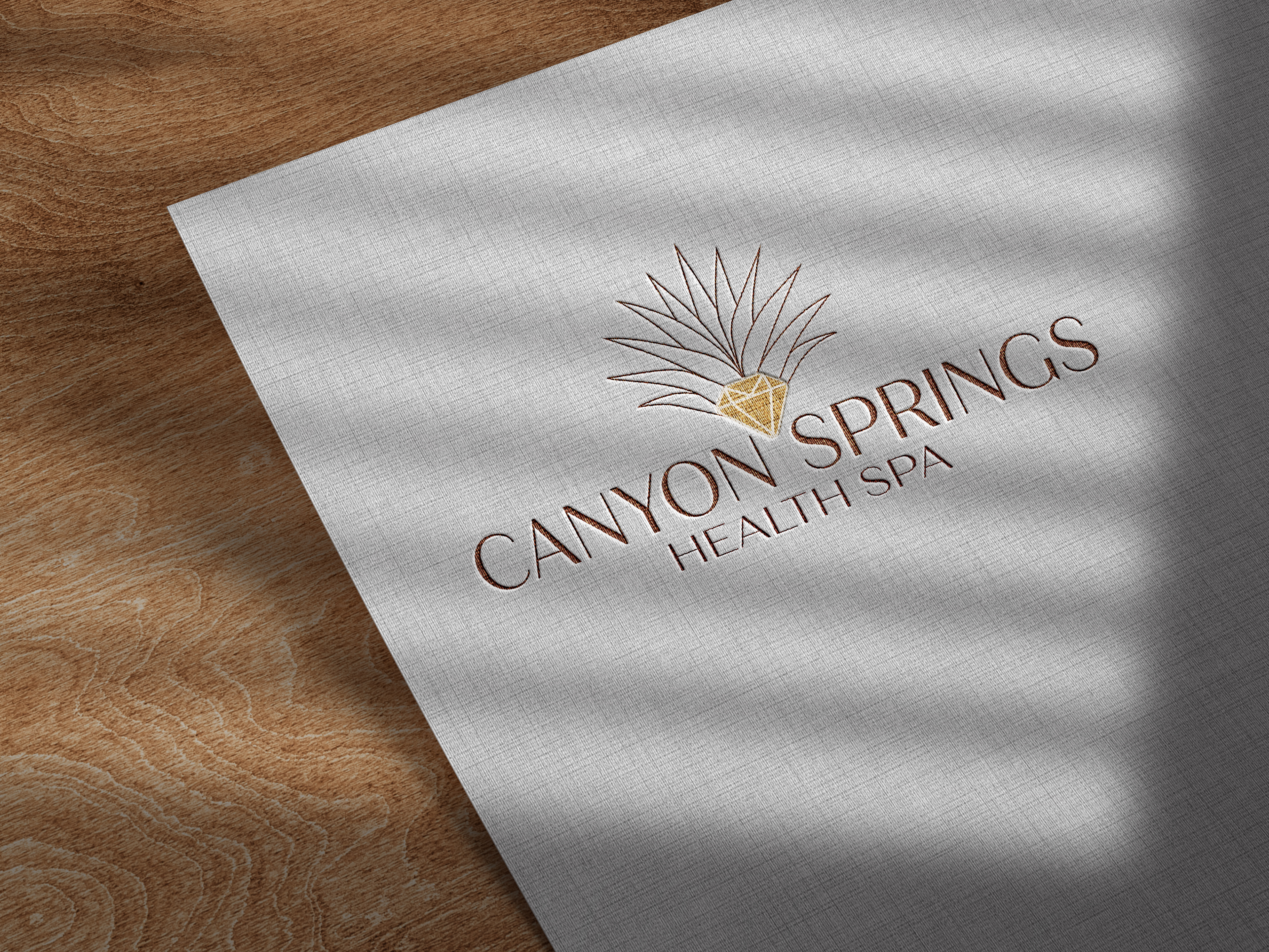
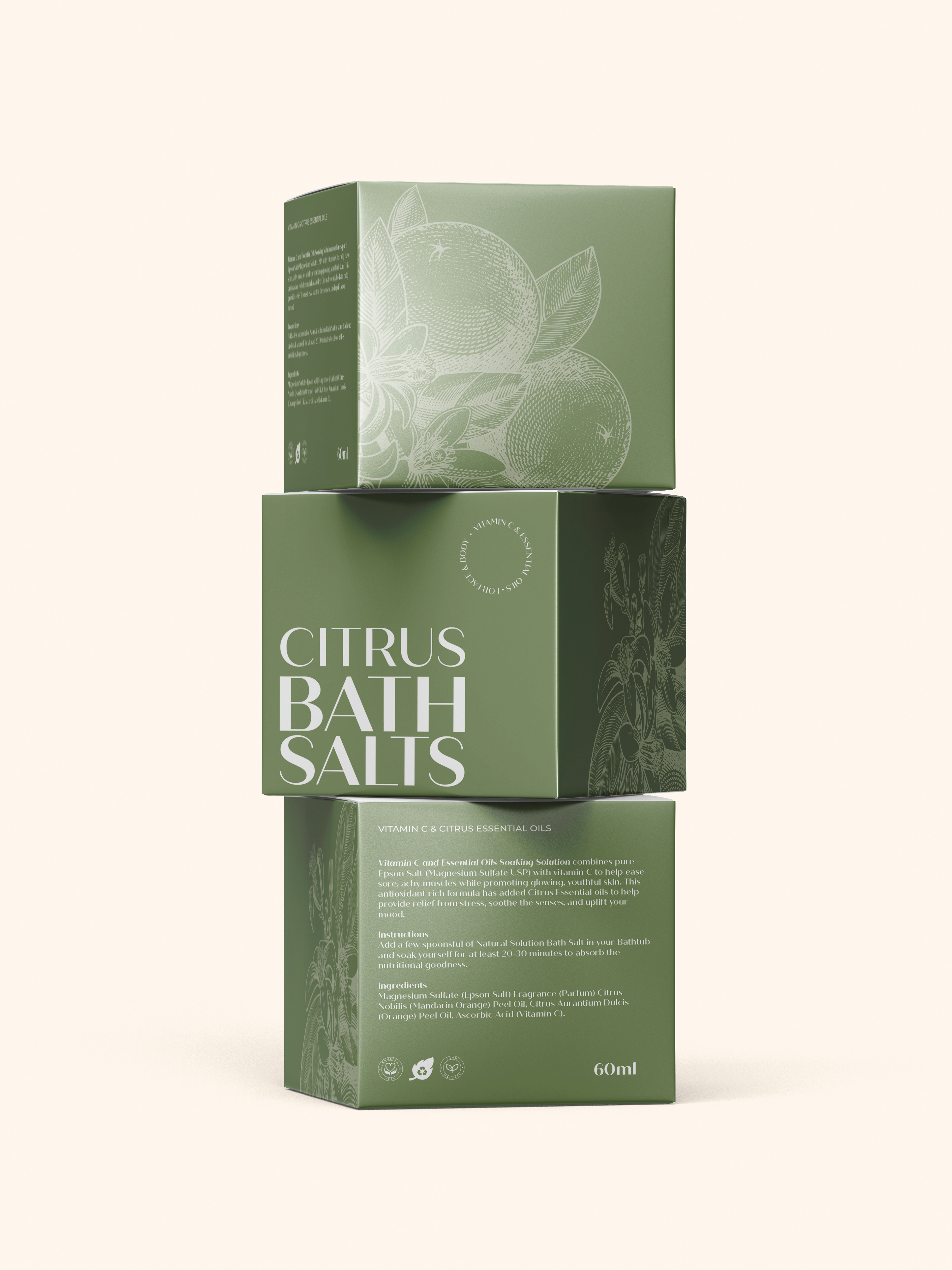
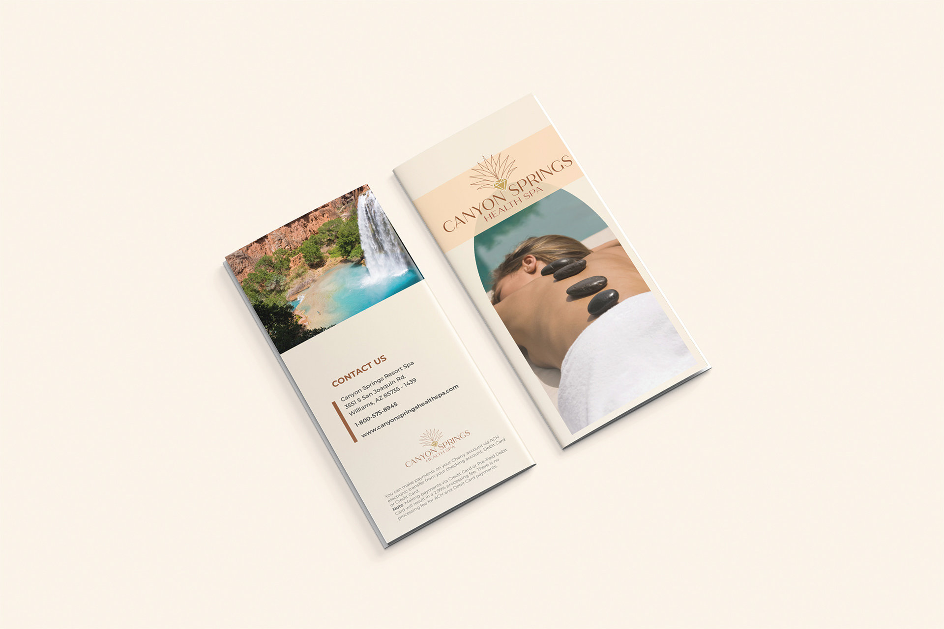
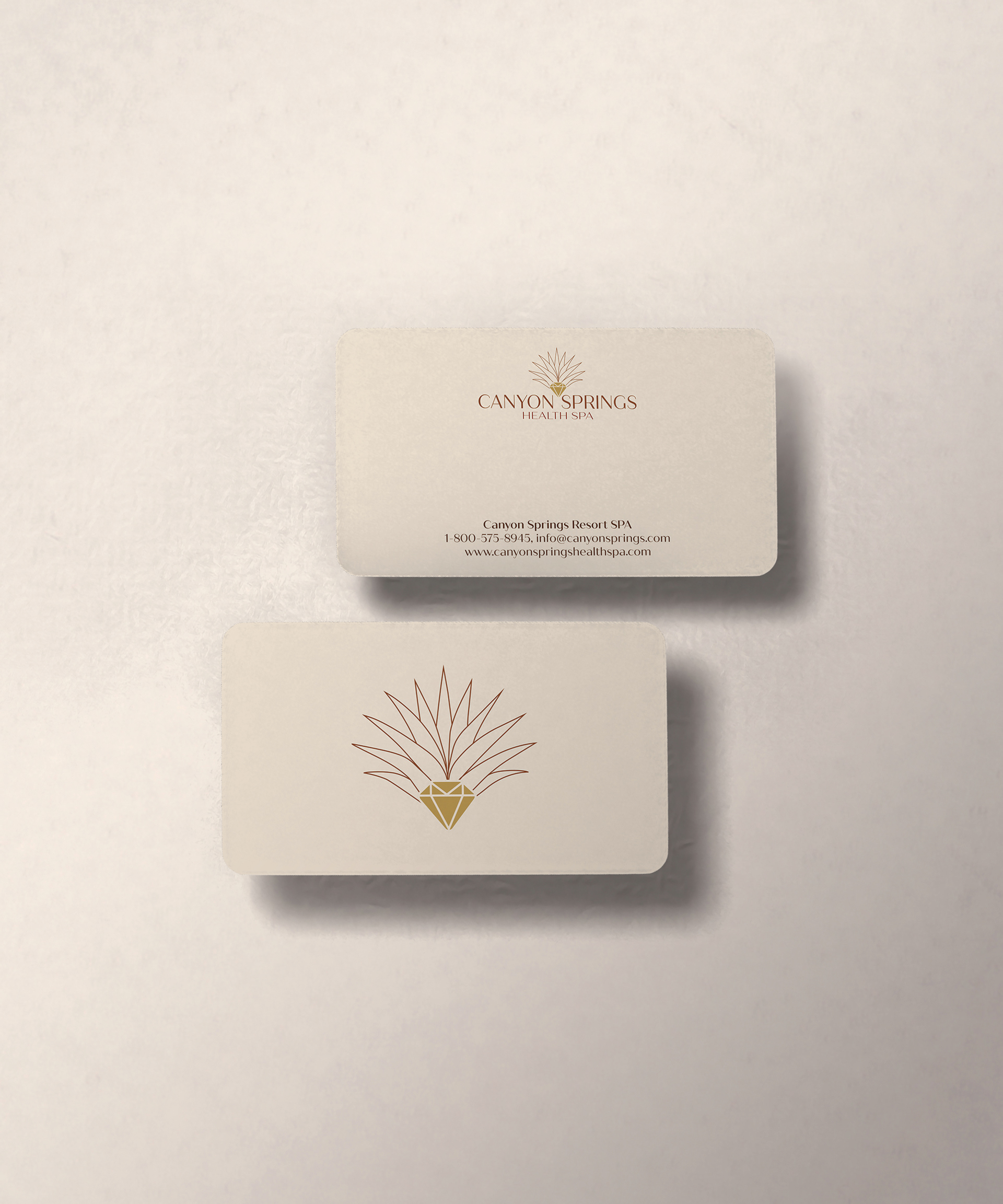
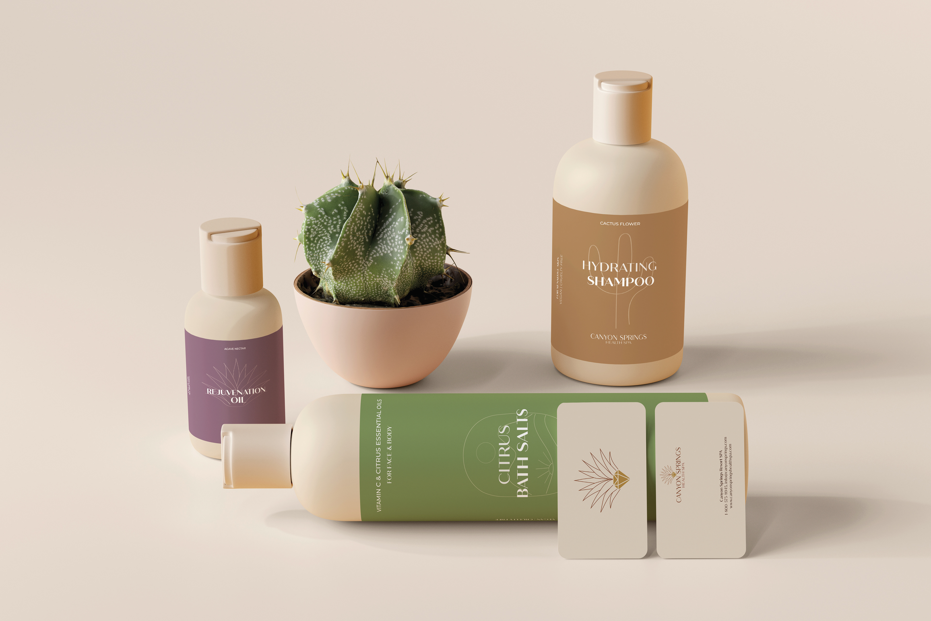
This branding campaign for Canyon Springs Health SPA focused on building a strong and flexible visual style across all materials. The logo features an elegant agave illustration that represents health, heritage, and care. Soft color contrasts and modern typography carry that same feeling through the print pieces. For the product labels, I used a richer color palette to highlight the spa’s nature-inspired products. All the design choices work together to create a brand that feels warm, calming, and refined, just like the spa experience itself.