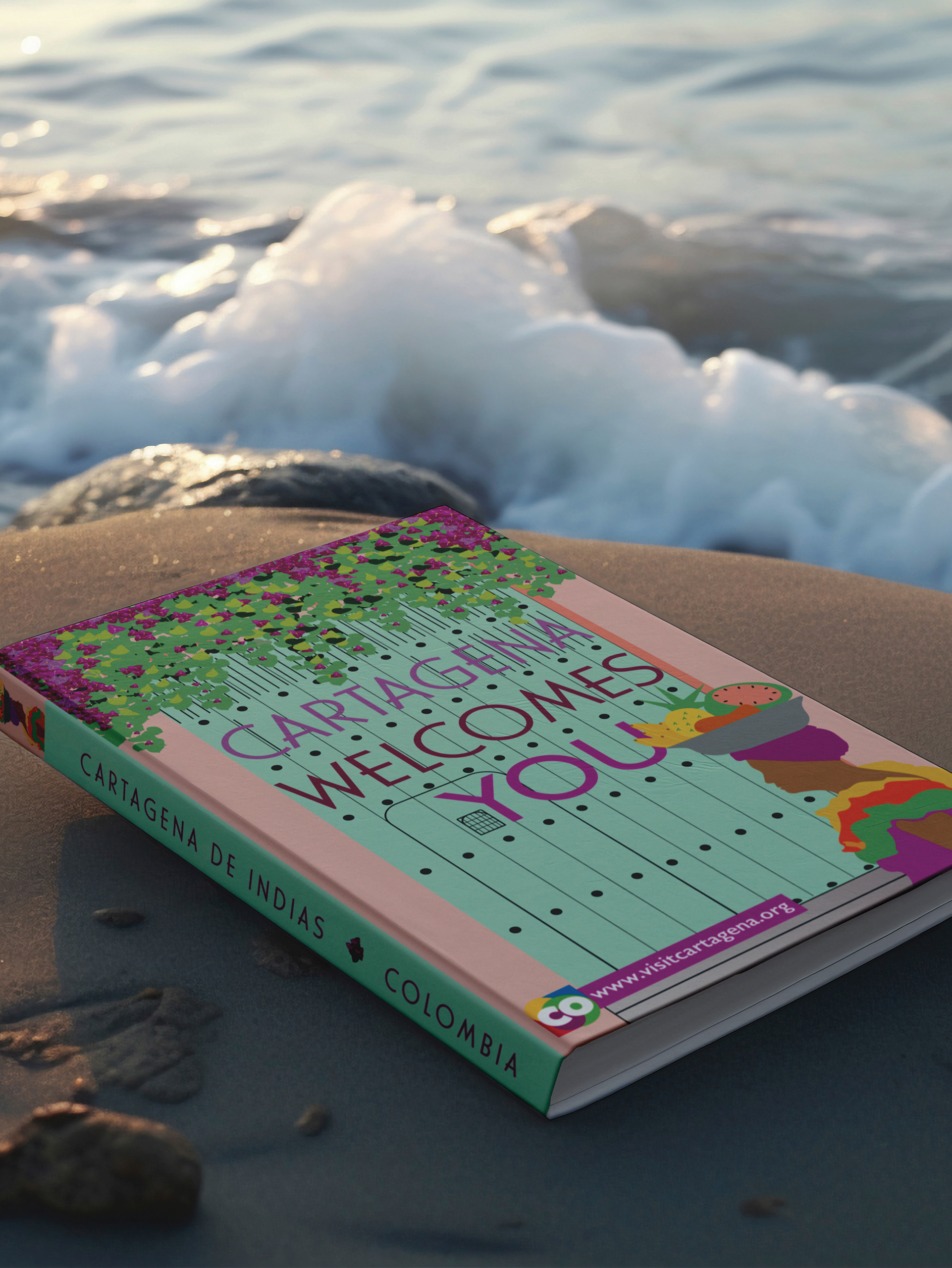

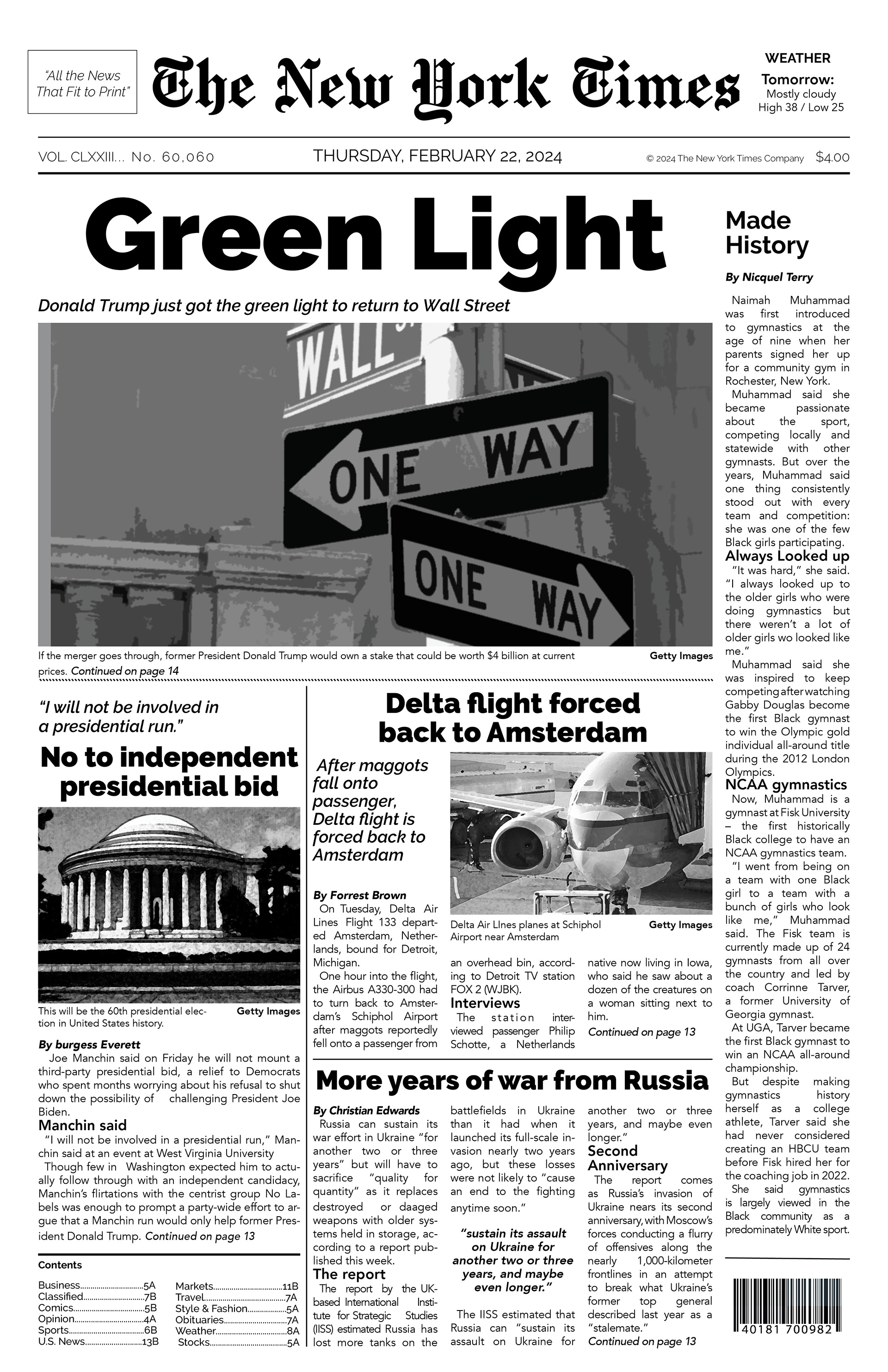
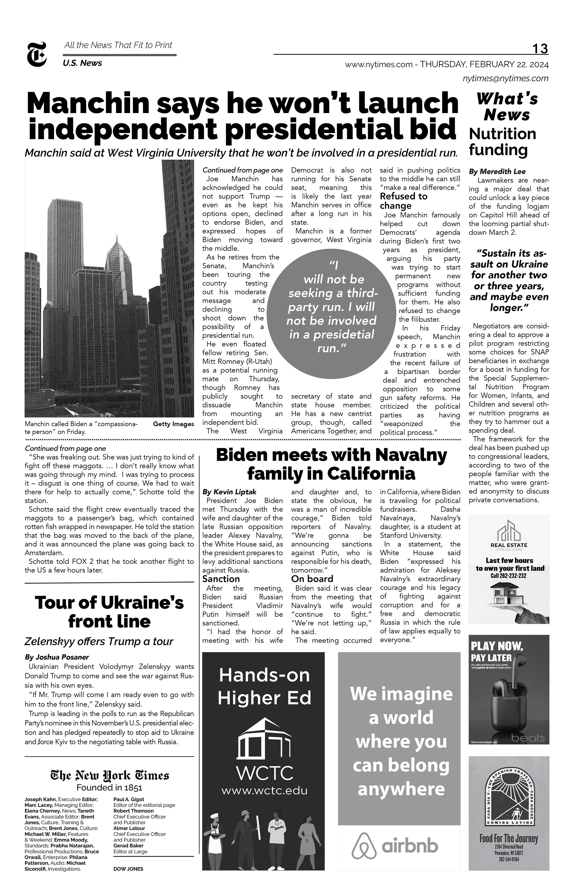
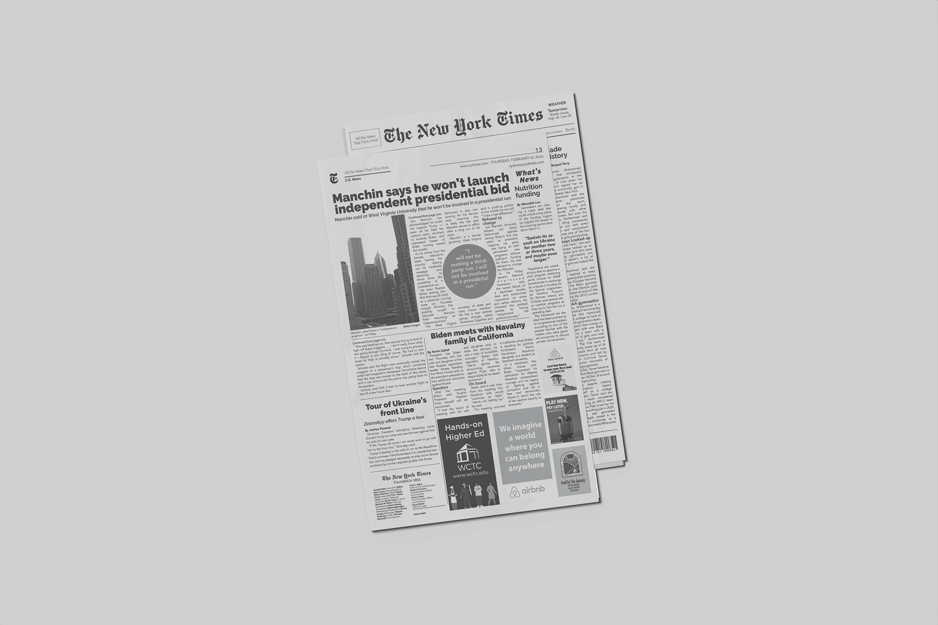
Inspired by the classic style of prestigious newspapers, I created a layout featuring six columns and varying headline sizes, drawing inspiration from publications like The New York Times and The Wall Street Journal. They aimed to infuse The New York Times' traditional aesthetics with a contemporary twist, redefining its style for a modern audience.
Opting for an 11x17 page format with 0.5-inch margins allowed for six columns with a 0.1575-inch gutter, ensuring flexibility for content placement. Careful content distribution maintained balance while emphasizing key sections with larger typography to capture readers' attention.
While newspapers typically use serif fonts, I made the deliberate choice to employ a sans-serif font for a fresh appearance. Avenir for article text and Raleway for headers, kickers, and decks enhance readability and visual appeal. The result is a contemporary newspaper layout that maintains authenticity while offering a new perspective on a renowned publication.
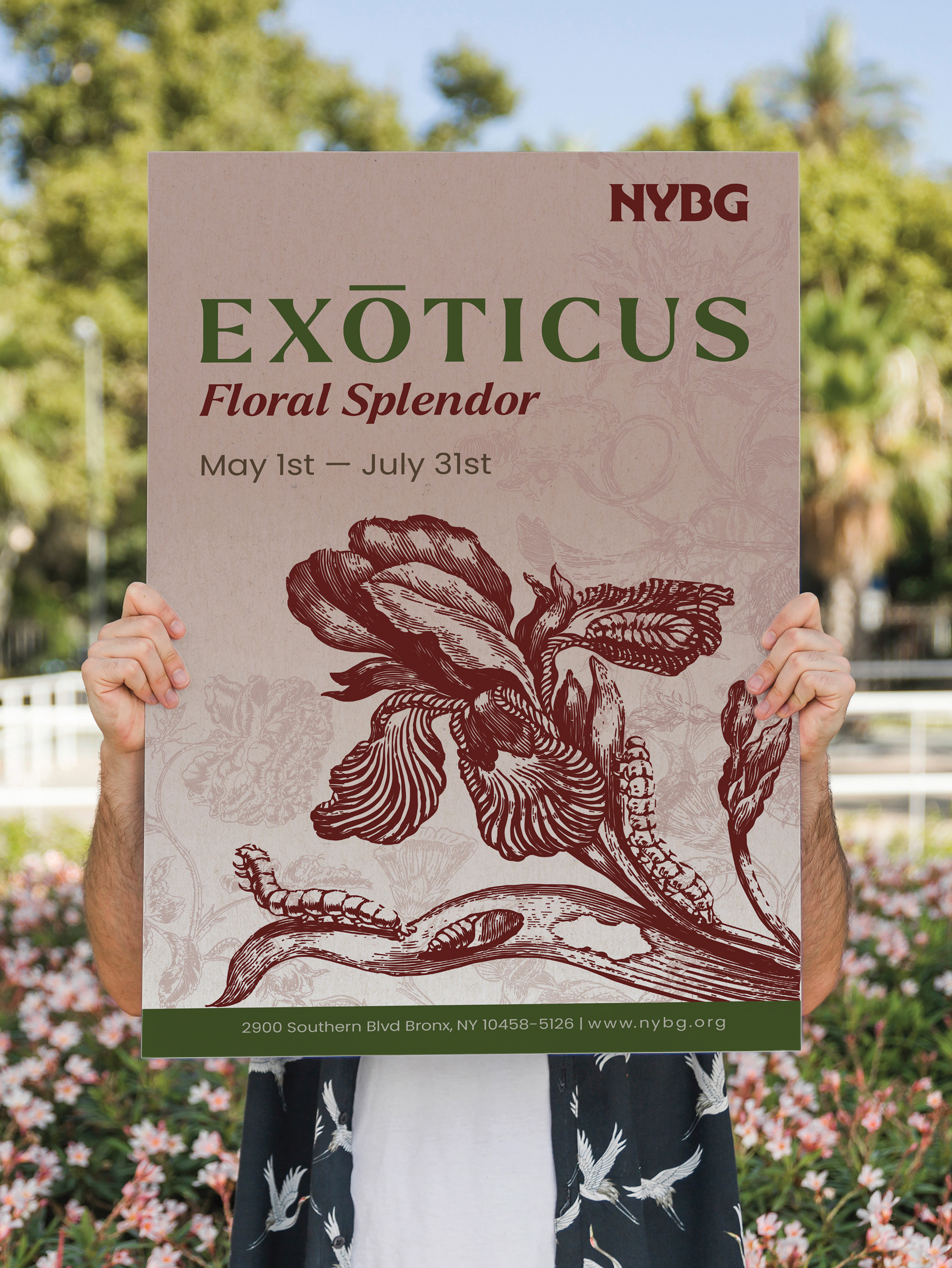
My background in Communications and Journalism gave me a strong foundation in both writing and layout. I wrote articles and designed the layout for news pages at a local newspaper in my home country, and also contributed to a magazine where I was involved in content and design decisions. That experience sparked my interest in graphic design. Since then, I’ve continued to build on those skills through various projects, working with different formats and refining my approach to layout and visual storytelling.