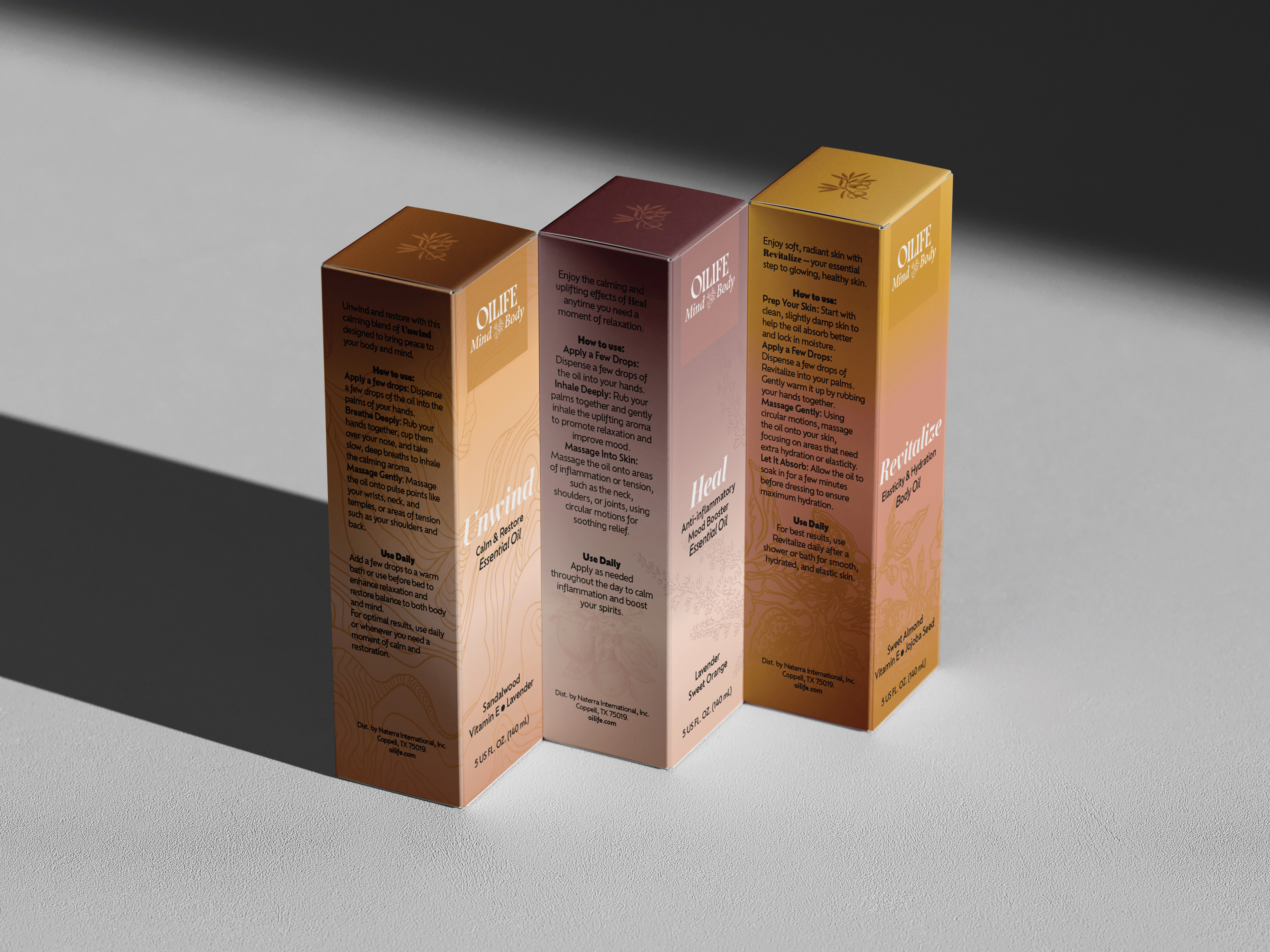
packaging design
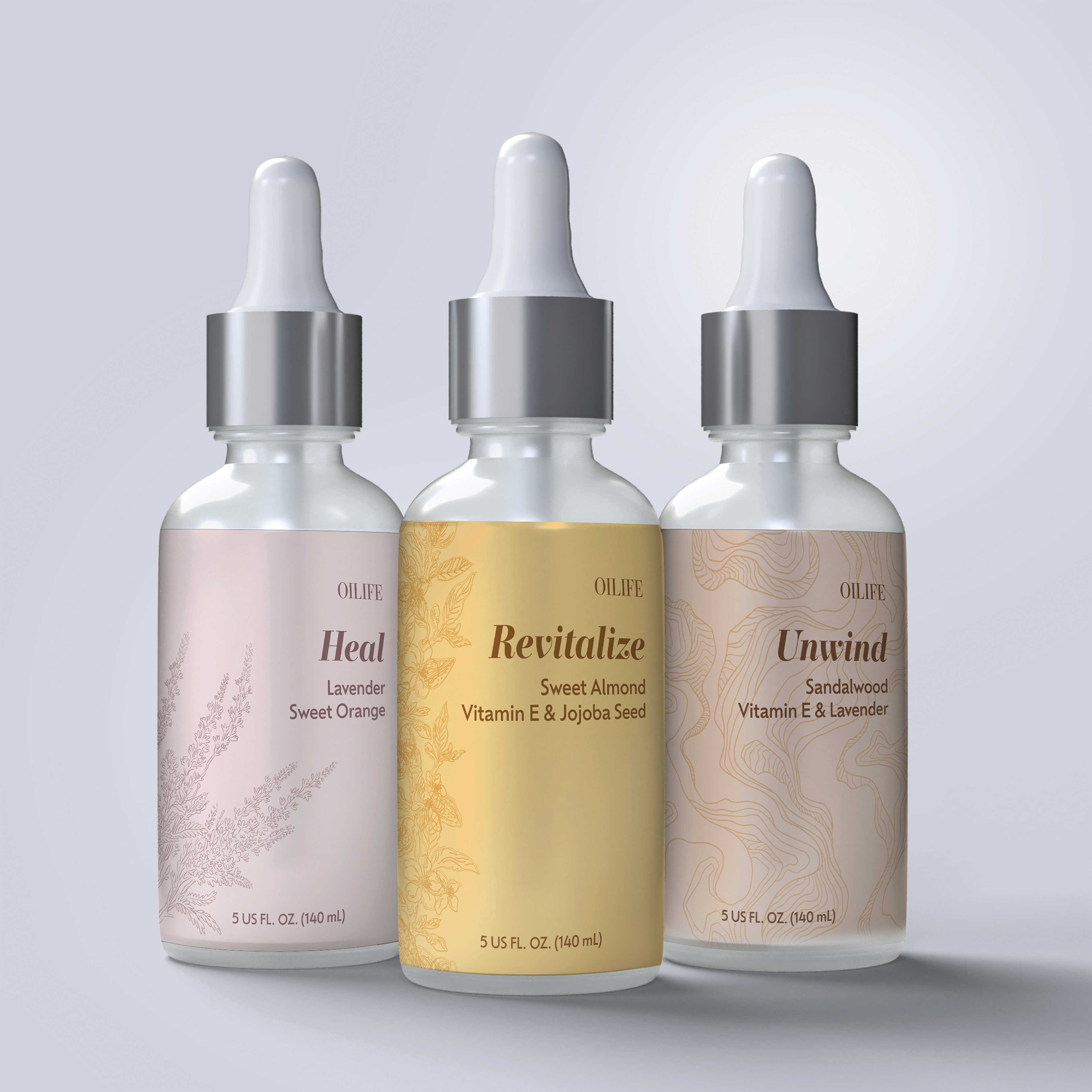
Labels Design
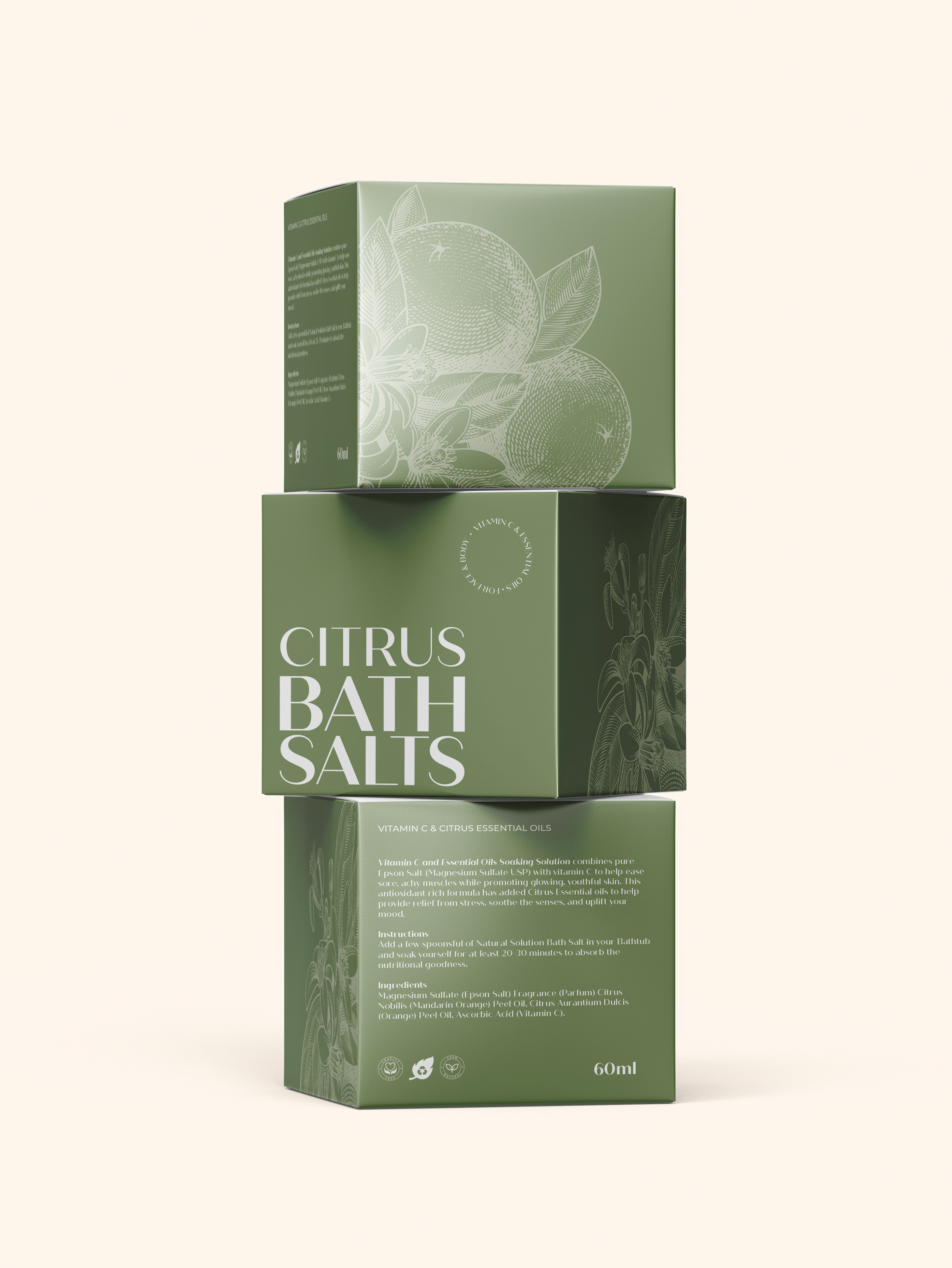
This packaging campaign blended modern elegance with a natural, wellness-focused look. I used warm gradient colors to reflect the benefits of each essential oil, creating an emotional connection. Subtle botanical line art added a clean, organic feel, while straightforward typography kept the design easy to read and calm. Altogether, the packaging reflects OILIFE’s message of self-care, balance, and mindful living.